Syndromic Surveillance Informs Decision to Safely Reopen Alabama Schools and Businesses

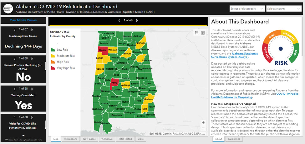
Before Alabama schools and businesses could reopen safely after closures due to COVID-19, the governor’s office and other policymakers needed reliable, timely information about the risk of the virus’s spread. To do this, the Alabama Department of Public Health combined data from its disease reporting and surveillance system and the Alabama Syndromic Surveillance System (AlaSyS)1 to create a COVID-19 Risk Indicator Dashboard.
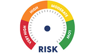
To generate Alabama-specific COVID-19 risk indictor reports, AlaSyS uses a modified version of R code developed in collaboration with the National Syndromic Surveillance Program (NSSP), National Healthcare Safety Network, and Centers for Disease Control and Prevention’s COVID-19 Response Case Surveillance Task Force. The dashboard’s syndromic data are drawn from emergency department admissions when people seek care. These data are compared with case-based information, including lab results, to calculate the risk of further spread. Each county’s risk of COVID-19 is categorized and color-coded green (Low), yellow (Moderate), orange (High), or red (Very High). The main indicator for limiting the risk of COVID-19 spread in the community is the number of days a county has a downward trend of new cases each day. Whether the case counts are increasing or decreasing influences a county’s risk (e.g., low risk).1 Other indicators are a decline in positive test results and decline in visits for COVID-like symptoms.
The dashboard is intuitive, actionable, and timely. It shows multiple metrics in an easy-to-read format and has become a highly used public health tool for decision-makers and the public. More than ever before, public health practitioners are finding innovative ways to make data understandable and useful to policy makers and the public. Through funding from NSSP, syndromic surveillance is improving the nation’s public health.
Links:
About Syndromic Surveillance in Alabama
Alabama’s COVID-19 Risk Indicator Dashboard
Alabama Public Health Guidance for Reopening
Examples

Alabama’s COVID-19 Risk Indicator Dashboard. The metrics on the left are the indicators that the Alabama Department of Public Health uses to assign risk categories. The text on the right describes how risk is calculated. In the center, the default is presentation of the county map, but tabs at the bottom allow a user to see a visual depiction of new cases, percent positive lab results for the week, total residents tested, and emergency department and urgent care center visits captured by syndromic surveillance.

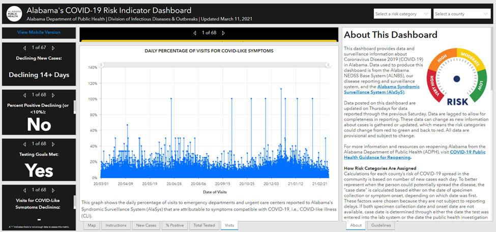
Daily Percentage of Visits for COVID-Like Symptoms. This visual, generated by AlaSys, uses data from the National Syndromic Surveillance Program. Syndromic surveillance shows the daily percentage of people who seek care in emergency departments and urgent care centers for symptoms potentially related to COVID-19.
Contacts
MisChele.Vickers@adph.state.al.us
Office of Public Health Data, Surveillance, and Technology
Division of Health Informatics and Surveillance
www.cdc.gov/nssp
This success story shows how NSSP
- Improves Data Representativeness
- Improves Data Quality, Timeliness, and Use
- Strengthens Syndromic Surveillance Practice
- Informs Public Health Action or Response
The findings and outcomes described in this syndromic success story are those of the authors and do not necessarily represent the official position of the National Syndromic Surveillance Program or the Centers for Disease Control and Prevention.
