Lesson 4: Displaying Public Health Data
Section 4: Other Data Displays
Thus far in this lesson, we have covered the most common ways that epidemiologists and other public health analysts display data in tables and graphs. We now cover some additional graphical techniques that are useful in specific situations. While you may not find yourself constructing these figures often, our objective is to equip you to properly interpret these displays when you encounter them.
Scatter diagrams
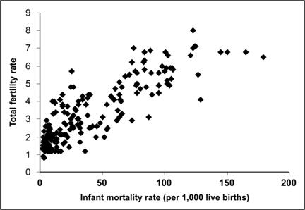
A scatter diagram (or “scattergram”) is a graph that portrays the relationship between two continuous variables, with the x-axis representing one variable and the y-axis representing the other.(15) To create a scatter diagram you must have a pair of values (one for each variable) for each person, group, country, or other entity in the data set, one value for each variable. A point is placed on the graph where the two values intersect. For example, demographers may be interested in the relationship between infant mortality and total fertility in various nations. Figure 4.19 plots the total fertility rate (estimated average number of children per woman) by the infant mortality rate in 194 countries, so this scatter diagram has 194 data points.
To interpret a scatter diagram, look at the overall pattern made by the plotted points. A fairly compact pattern of points from the lower left to the upper right indicates a positive correlation, in which one variable increases as the other increases. A compact pattern from the upper left to lower right indicates a negative or inverse correlation, in which one variable decreases as the other increases. Widely scattered points or a relatively flat pattern indicates little correlation. The data in Figure 4.19 seem to show a positive correlation between infant mortality and total fertility, that is, countries with high infant mortality seem to have high total fertility as well. Statistical tools such as linear regression can be applied to such data to quantify the correlation between variables in a scatter diagram. Similarly, scatter diagrams often display correlations that may provoke intriguing hypotheses about causal relationships, but additional investigation is almost always needed before any causal hypotheses should be accepted.
Figure 4.19 Correlation of Infant Mortality Rate and Total Fertility Rate Among 194 Nations, 1997
Data Source: Population Reference Bureau [Internet]. Datafinder [cited 2004 Dec 13]. Available from: http://www.prb.org/datafind/datafinder7.htm.
Bar charts
A bar chart uses bars of equal width to display comparative data. Comparison of categories is based on the fact that the length of the bar is proportional to the frequency of the event in that category. Therefore, breaks in the scale could cause the data to be misinterpreted and should not be used in bar charts. Bars for different categories are separated by spaces (unlike the bars in a histogram). The bar chart can be portrayed with the bars either vertical or horizontal. (This choice is usually made based on the length of text labels — long labels fit better on a horizontal chart than a vertical one) The bars are usually arranged in ascending or descending length, or in some other systematic order dictated by any intrinsic order of the categories. Appropriate data for bar charts include discrete data (e.g., race or cause of death) or variables treated as though they were discrete (age groups). (Recall that a histogram shows frequency of a continuous variable, such as dates of onset of symptoms).
More About Constructing Bar Charts
- Arrange the categories that define the bars or groups of bars in a natural order, such as alphabetical or increasing age, or in an order that will produce increasing or decreasing bar lengths.
- Choose whether to display the bars vertically or horizontally.
- Make all of the bars the same width.
- Make the length of bars in proportion to the frequency of the event. Do not use a scale break, because the reader could easily misinterpret the relative size of different categories.
- Show no more than five bars within a group of bars, if possible.
- Leave a space between adjacent groups of bars but not between bars within a group (see Figure 4.22).
- Within a group, code different variables by differences in bar color, shading, cross hatching, etc. and include a legend that interprets your code.
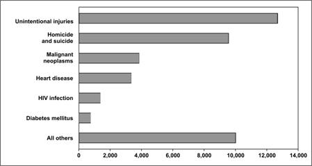
The simplest bar chart is used to display the data from a one-variable table (see page 4-4). Figure 4.20 shows the number of deaths among persons ages 25–34 years for the six most common causes, plus all other causes grouped together, in the United States in 2003. Note that this bar chart is aligned horizontally to allow for long labels.
Figure 4.20 Number of Deaths by Cause Among 25–34 Year Olds — United States, 2003
Data Source: Web-based Injury Statistics Query and Reporting System (WISQARS) [online database] Atlanta; National Center for Injury Prevention and Control. [cited 2006 Feb 15]. Available from: https://www.cdc.gov/injury/wisqars/index.html.
Grouped bar charts
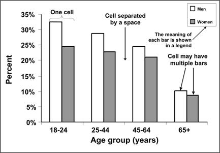
A grouped bar chart is used to illustrate data from two-variable or three-variable tables. A grouped bar chart is particularly useful when you want to compare the subgroups within a group. Bars within a group are adjoining. The bars should be illustrated distinctively and described in a legend. For example, consider the data for Figure 4.12 — current smokers by age and sex. In Figure 4.21, each bar grouping represents an age group. Within the group, separate bars are used to represent data for males and females. This shows graphically that regardless of age, men are more likely to be current smokers than are women, but that difference declines with age.
Figure 4.21 Percentage of Persons Aged ≥18 Years Who Were Current Smokers, by Age and Sex — United States, 2002
Data Source:Centers for Disease Control and Prevention. Cigarette smoking among adults– United States, 2002. MMWR 2004;53:427–31.
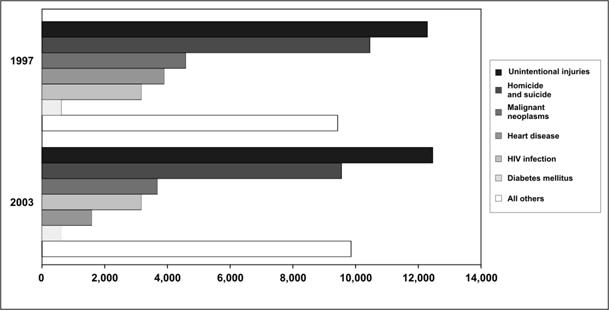
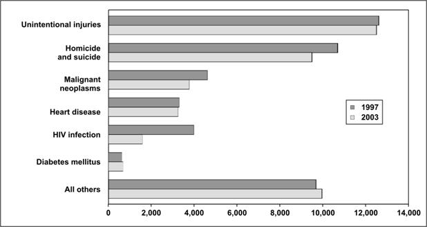
The bar chart in Figure 4.22a shows the leading causes of death in 1997 and 2003 among persons ages 25–34 years. The graph is more effective at showing the differences in causes of death during the same year than in showing differences in a single cause between years. While the decline in deaths due to HIV infection between 1997 and 2003 is quite apparent, the smaller drop in heart disease is more difficult to see. If the goal of the figure is to compare specific causes between the two years, the bar chart in Figure 4.22b is a better choice.
Figure 4.22a Number of Deaths by Cause Among 25–34 Year Olds — United States, 1997 and 2003
Data Source: Web-based Injury Statistics Query and Reporting System (WISQARS) [online database] Atlanta; National Center for Injury Prevention and Control. [cited 2006 Feb 15]. Available from: https://www.cdc.gov/injury/wisqars/.
Figure 4.22b Number of Deaths by Cause Among 25–34 Year Olds — United States, 1997 and 2003
Data Source: Web-based Injury Statistics Query and Reporting System (WISQARS) [online database] Atlanta; National Center for Injury Prevention and Control. [cited 2006 Feb 15]. Available from: https://www.cdc.gov/injury/wisqars/.
Stacked bar charts
A stacked bar chart is used to show the same data as a grouped bar chart but stacks the subgroups of the second variable into a single bar of the first variable. It deviates from the grouped bar chart in that the different groups are differentiated not with separate bars, but with different segments within a single bar for each category. A stacked bar chart is more effective than a grouped bar chart at displaying the overall pattern of the first variable but less effective at displaying the relative size of each subgroup. The trends or patterns of the subgroups can be difficult to decipher because, except for the bottom categories, the categories do not rest on a flat baseline.
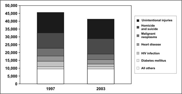
To see the difference between grouped and stacked bar charts, look at Figure 4.23. This figure shows the same data as Figures 4.22a and 4.22b. With the stacked bar chart, you can easily see the change in the total number of deaths between the two years; however, it is difficult to see the values of each cause of death. On the other hand, with the grouped bar chart, you can more easily see the changes by cause of death.
Figure 4.23 Number of Deaths by Cause Among 25–44 Year Olds — United States, 1997 and 2003
Data Source: Web-based Injury Statistics Query and Reporting System (WISQARS) [online database] Atlanta; National Center for Injury Prevention and Control. [cited 2006 Feb 15]. Available from: https://www.cdc.gov/injury/wisqars/.
100% component bar charts
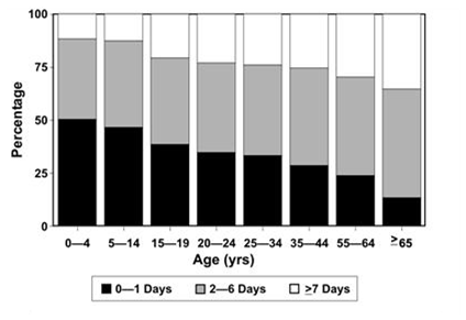
A 100% component bar chart is a variant of a stacked bar chart, in which all of the bars are pulled to the same height (100%) and show the components as percentages of the total rather than as actual values. This type of chart is useful for comparing the contribution of different subgroups within the categories of the main variable. Figure 4.24 shows a 100% component bar chart that compares lengths of hospital stay by age group. The figure clearly shows that the percentage of people who stay in the hospital for 1 day or less (bottom component) is greatest for children ages 0–4 years, and declines with increasing age. Concomitantly, lengths of stay of 7 or more days increase with age. However, because the columns are the same height, you cannot tell from the columns how many people in each age group were hospitalized for traumatic brain injury — putting numbers above the bars to indicate the totals in each age group would solve that problem.
Figure 4.24 Length of Hospital Stay for Traumatic Brain Injury-related Discharges — 14 States*, 1997
* Alaska, Arizona, California, Colorado, Louisiana, Maryland, Minnesota, Missouri, Nebraska, New York, Oklahoma, Rhode Island, South Carolina and Utah.
Source: Langlois JA, Kegler SR, Butler JA, Gotsch KE, Johnson RL, Reichard AA, et al. Traumatic brain injury-related hospital discharges: results from a 14-state surveillance system. In: Surveillance Summaries, June 27, 2003. MMWR 2003;52(No. SS-04):1–18.
Deviation bar charts
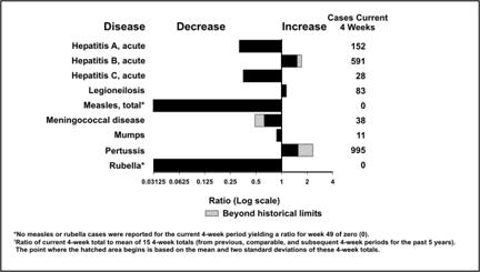
While many bar charts show only positive values, a deviation bar chart displays both positive and negative changes from a baseline. (Imagine profit/loss data at different times.) Figure 4.25 shows such a deviation bar chart of selected reportable diseases in the United States. A similar chart appears in each issue of CDC’s Morbidity and Mortality Weekly Report. In this chart, the number of cases reported during the past 4 weeks is compared to the average number reported during comparable periods of the past few years. The deviations to the right for hepatitis B and pertussis indicate increases over historical levels. The deviations to the left for measles, rubella, and most of the other diseases indicate declines in reported cases compared to past levels. In this particular chart, the x-axis is on a logarithmic scale, so that a 50% reduction (one-half of the cases) and a doubling (50% increase) of cases are represented by bars of the same length, though in opposite directions. Values beyond historical limits (comparable to 95% confidence limits) are highlighted for special attention.
Figure 4.25 Comparison of Current Four-week Totals with Historical Data for Selected Notifiable Diseases — United States, 4-weeks Ending December 11, 2004
Source: Centers for Disease Control and Prevention. Figure 1. Selected notifiable disease reports, United States, comparison of provisional 4-week totals ending December 11, 2004, with historical data. MMWR 2004;53:1161.
 Exercise 4.6
Use the data in Table 4.17 to draw a stacked bar chart, a grouped bar chart, and a 100% component bar chart to illustrate the differences in the age distribution of syphilis cases among white males, white females, black males, and black females. What information is best conveyed by each chart? Graph paper is provided at the end of this lesson.
Table 4.17 Number of Reported Cases of Primary and Secondary Syphilis, by Age Group, Among Non-Hispanic Black and White Men and Women — United States, 2002
| Age Group (Years) | Black Men |
White Men |
Black Women |
White Women |
|---|---|---|---|---|
| <20 | 804 | 905 | 277 | 50 |
| 20–29 | 695 | 914 | 349 | 66 |
| 30–39 | 635 | 277 | 396 | 76 |
| ≥40 | 92 | 12 | 173 | 25 |
Data Source: Centers for Disease Control and Prevention. Sexually Transmitted Disease Surveillance 2002. Atlanta: U.S. Department of Health and Human Services; 2003.
Pie charts
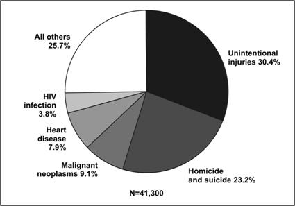
Textbox module not selected or not found.A pie chart is a simple, easily understood chart in which the size of the “slices” or wedges shows the proportional contribution of each component part.(16) Pie charts are useful for showing the proportions of a single variable’s frequency distribution. Figure 4.26 shows a simple pie chart of the leading causes of death in 2003 among persons aged 25–34 years.
Figure 4.26 Number of Deaths by Cause Among 25–34 Year Olds — United States, 2003
Data Source: Web-based Injury Statistics Query and Reporting System (WISQARS) [online database] Atlanta; National Center for Injury Prevention and Control. [cited 2006 Feb 15]. Available from: https://www.cdc.gov/injury/wisqars/.
More About Constructing Pie Charts
- Conventionally, pie charts begin at 12 o’clock.
- The wedges should be labeled and arranged from largest to smallest, proceeding clockwise, although the “other” or “unknown” may be last.
- Shading may be used to distinguish between slices but is not always necessary.
- Because the eye cannot accurately gauge the area of the slices, the chart should indicate what percentage each slice represents either inside or near each slice.
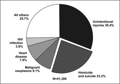
Given current technology, pie charts are almost always generated by computer rather than drawn by hand. But the default settings of many computer programs differ from recommended epidemiologic practice. Many computer programs allow one or more slices to “explode” or be pulled out of the pie. In general, this technique should be limited to situations when you want to place special emphasis on one wedge, particularly when additional detail is provided about that wedge (Figure 4.27).
Figure 4.27 Number of Deaths by Cause Among 25–34 Year Olds — United States, 2003
Data Source: Web-based Injury Statistics Query and Reporting System (WISQARS) [online database] Atlanta; National Center for Injury Prevention and Control. [cited 2006 Feb 15]. Available from: https://www.cdc.gov/injury/wisqars/.
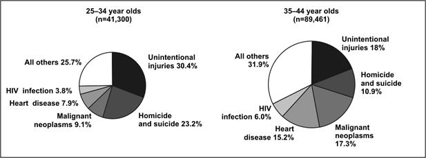
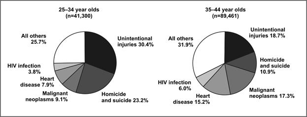
Multiple pie charts are occasionally used in place of a 100% component bar chart, that is, to display differences in proportional distributions. In some figures the size of each pie is proportional to the number of observations, but in others the pies are the same size despite representing different numbers of observations (Figure 4.28a and 4.28b).
Figure 4.28a Number of Deaths by Cause Among 25–34 and 35-44 Year Olds — United States, 2003
Data Source: Web-based Injury Statistics Query and Reporting System (WISQARS) [online database] Atlanta; National Center for Injury Prevention and Control. [cited 2006 Feb 15]. Available from: https://www.cdc.gov/injury/wisqars/.
Figure 4.28b Number of Deaths by Cause Among 25–34 and 35-44 Year Olds — United States, 2003
Data Source: Web-based Injury Statistics Query and Reporting System (WISQARS) [online database] Atlanta; National Center for Injury Prevention and Control. [cited 2006 Feb 15]. Available from: https://www.cdc.gov/injury/wisqars/.
Dot plots and box plots
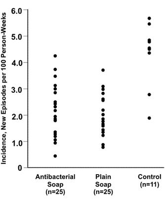
A dot plot uses dots to show the relationship between a categorical variable on the x-axis and a continuous variable on the y-axis. A dot is positioned at the appropriate place for each observation. The dot plot displays not only the clustering and spread of observations for each category of the x-axis variable but also differences in the patterns between categories. In Figure 4.29 the villages using either antibacterial soap or plain soap have lower incidence rates of diarrhea than do the control (no soap) villages.(17)
Figure 4.29 Incidence of Childhood Diarrhea in Each Neighborhood by Hygiene Intervention Group — Pakistan, 2002–2003
Source: Luby SP, Agboatwalla M, Painter J, Altaf A, Billhimer WL, Hoekstra RM. Effect of intensive handwashing promotion on childhood diarrhea in high-risk communities in Pakistan: a randomized controlled trial. JAMA 2004;291:2547–54.
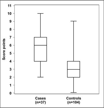
A dot plot shows the relationship between a continuous and a categorical variable. The same data could also be displayed in a box plot, in which the data are summarized by using “box-and-whiskers.” Figure 4.30 is an example of a box plot. The “box” represents values of the middle 50% (or interquartile range) of the data points, and the “whiskers” extend to the minimum and maximum values that the data assume. The median is usually marked with a horizontal line inside the box. As a result, you can use a box plot to show and compare the central location (median), dispersion (interquartile range and range), and skewness (indicated by a median line not centered in the box, such as for the cases in Figure 4.30).(18)
Figure 4.30 Risk Score for Alveolar Echinococcosis Among Cases and Controls — Germany, 1999–2000
Adapted from: Kern P, Ammon A, Kron M, Sinn G, Sander S, Petersen LR, et al. Risk factors for alveolar echinococcosis in humans. Emerg Infect Dis 2004;10:2089-93.
Forest plots
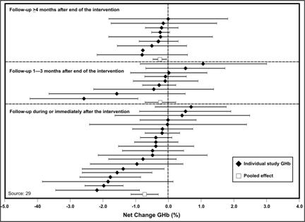
A forest plot, also called a confidence interval plot, is used to display the point estimates and confidence intervals of individual studies assembled for a meta-analysis or systematic review.(19) In the forest plot, the variable on the x-axis is the primary outcome measure from each study (relative risk, treatment effects, etc.). If risk ratio, odds ratio, or another ratio measure is used, the x-axis uses a logarithmic-scale. This is because the logarithmic transformation of these risk estimates has a more symmetric distribution than do the risk estimates themselves (since the risk estimates can vary from zero to an arbitrarily large number). Each study is represented by a horizontal line — reflecting the confidence interval — and a dot or square — reflecting the point estimate — usually due to study size or some other aspect of study design (Figure 4.31). The shorter the horizontal line, the more precise the study’s estimate. Point estimates (dots or squares) that line up reasonably well indicate that the studies show a relatively consistent effect. A vertical line indicates where no effect (relative risk = 1 or treatment effect = 0) falls on the x-axis. If a study’s horizontal line does not cross the vertical line, that study’s result is statistically significant. From a forest plot, one can easily ascertain patterns among studies as well as outliers.
Figure 4.31 Net Change in Glycohemoglobin (GHb) Following Self-management Education Intervention for Adults with Type 2 Diabetes, by Different Studies and Follow-up Intervals, 1980–1999
Source: Norris SL, Lau J, Smith SJ, Schmid CH, Engelgau MM. Self-management education for adults with type 2 diabetes. Diabetes Care 2002;25:1159–71.
Phylogenetic trees
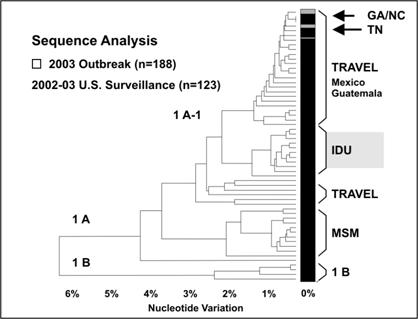
A phylogenetic tree, a type of dendrogram, is a branching chart that indicates the evolutionary lineage or genetic relatedness of organisms involved in outbreaks of illness. Distance on the tree reflects genetic differences, so organisms that are close to one another on the tree are more related than organisms that are further apart. The phylogenetic tree in Figure 4.32 shows that the organisms isolated from patients with restaurant-associated hepatitis A in Georgia and North Carolina were identical and closely related to those from patients in Tennessee.(20) Furthermore, these organisms were similar to those typically seen in patients from Mexico. These microbiologic data supported epidemiologic data which implicated green onions from Mexico.
Figure 4.32 Comparison of Genetic Sequences of Hepatitis A Virus Isolates from Outbreaks in Georgia, North Carolina, and Tennessee in 2003 with Isolates from National Surveillance
Source: Amon JJ, Devasia R, Guoliang X, Vaughan G, Gabel J, MacDonald P, et al. Multiple hepatitis A outbreaks associated with green onions among restaurant patrons–Tennessee, Georgia, and North Carolina, 2003. Presented at 53rd Annual Epidemic Intelligence Service Conference, April 19-23, 2004, Atlanta, Georgia.
Decision trees
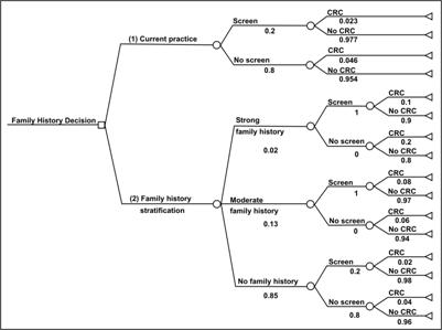
A decision tree is a branching chart that represents the logical sequence or pathway of a clinical or public health decision.(21)
Decision analysis is a systematic method for making decisions when outcomes are uncertain. The basic building blocks of a decision analysis are (1) decisions, (2) outcomes, and (3) probabilities.
A decision is a choice made by a person, group, or organization to select a course of action from among a set of mutually exclusive alternatives. The decision maker compares expected outcomes of available alternatives and chooses the best among them. This choice is represented by a decision node, a square, with branches representing the choices in the decision-tree diagram (for example, see Figure 4.33). For example, after receiving information that a person has a family history of a disease (colorectal cancer for this example), that person may decide (choose) to seek medical advice or choose not to do so.
Outcomes are the chance events that occur in response to a decision. Outcomes can be intermediate or final. Intermediate outcomes are followed by more decisions or chance events. For example, if a person decides to seek medical care for colorectal cancer screening, depending on the findings (outcomes) of the screening, his or her physician may advise diet or more frequent screenings; some combination of these two; or treatment. From the person’s perspective, this is a chance outcome; from a health-care provider’s perspective, it is a decision. Whether an outcome is intermediate or final may depend on the context of the decision problem. For example, colorectal cancer screening may be the final outcome in a decision analysis focusing on colorectal cancer as the health condition of interest, but it may be an intermediate outcome in a decision analysis focusing on more invasive cancer treatment. In a decision tree, outcomes follow a chance node, a circle, with branches representing different outcomes that occur by chance, one and only one of which occurs.
Each chance outcome has a probability by which it can occur written below the branch in a decision-tree diagram. The sum of probabilities for all outcomes that can occur at a chance node is one. The building blocks of decision analysis –– decisions, outcomes, and probabilities — can be used to represent and examine complex decision problems.
Figure 4.33 Decision Tree Comparing Colorectal Screening Current Practice with a Targeted Family History Strategy
Source: Tyagi A, Morris J. Using decision analytic methods to assess the utility of family history tools. Am J Prev Med 2003;24:199–207.
Maps
Textbox module not selected or not found.Maps are used to show the geographic location of events or attributes. Two types of maps commonly used in field epidemiology are spot maps and area maps. Spot maps use dots or other symbols to show where each case-patient lived or was exposed. Figure 4.34 is a spot map of the residences of persons with West Nile Virus encephalitis during the outbreak in the New York City area in 1999.A spot map is useful for showing the geographic distribution of cases, but because it does not take the size of the population at risk into account a spot map does not show risk of disease. Even when a spot map shows a large number of dots in the same area, the risk of acquiring disease may not be particularly high if that area is densely populated.
More About Constructing Maps
- Excellent examples of the use of maps to display public health data are available in these selected publications:
- Atlas of United States Mortality, U. S. Department of Health and Human Services, Centers for Disease Control and Prevention, Hyattsville, MD, 1996 (DHHS Publication No. (PHS) 97-1015)
- Atlas of AIDS. Matthew Smallman-Raynor, Andrew Cliff, and Peter Haggett. Blackwell Publishers, Oxford, UK, 1992
- An Historical Geography of a Major Human Viral Disease: From Global Expansion to Local Retreat, 1840-1990. Andrew Cliff, Peter Haggett, Matthew Smallman-Raynor. Blackwell Publishers, Oxford, UK, 1988
Figure 4.34 Laboratory-confirmed Cases of West Nile Virus Disease — New York City, August–September 1999

Source: Nash D, Mostashari F, Murray K, et al. Recognition of an outbreak of West Nile Virus disease. Presented at 49th Annual Epidemic Intelligence Service Conference, April 10–14, 2000, Atlanta, Georgia.
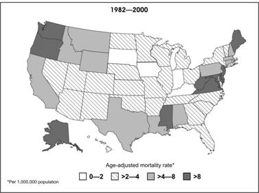
An area map, also called a choropleth map, can be used to show rates of disease or other health conditions in different areas by using different shades or colors (Figure 4.35). When choosing shades or colors for each category, ensure that the intensity of shade or color reflects increasing disease burden. In Figure 4.35, as mortality rates increase, the shading becomes darker.
Figure 4.35 Mortality Rates (per 100,000) for Asbestosis by State — United States, 1982–2000
Source: Centers for Disease Control and Prevention. Changing patterns of pneumoconiosis mortality–United States, 1968-2000. MMWR 2004;53:627–31.
 Exercise 4.7
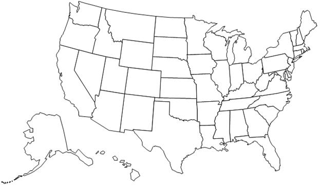
Using the cancer mortality data in Table 4.13, construct an area map based on dividing the states into four quartiles as follows:
- Oklahoma through Kentucky
- Pennsylvania through Missouri
- Connecticut through Florida
- Utah through New York
A map of the United States is provided below for your use.
More About Geographic Information Systems (GIS)
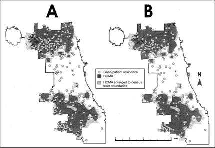
A geographic information system is a computer system for the input, editing, storage, retrieval, analysis, synthesis, and output of location-based information.(22) In public health, GIS may use geographic distribution of cases or risk factors, health service availability or utilization, presence of insect vectors, environmental factors, and other location-based variables. GIS can be particularly effective when layers of information or different types of information about place are combined to identify or clarify geographic relationships. For example, in Figure 4.36, human cases of West Nile virus are shown as dots superimposed over areas of high crow mortality within the Chicago city limits.
Figure 4.36 High Crow-mortality Areas (HCMAs) and Reported Residences of A) West Nile Virus (WNV)-infected Case-patients, or B) WNV Meningoencephalitis Case-patients (WNV Fever Cases Excluded) — Chicago, Illinois, 2002
Source: Watson JT, Jones RC, Gibbs K, Paul W. Dead crow reports and location of human West Nile virus cases, Chicago, 2002. Emerg Infect Dis 2004;10:938–40.
References (This Section)
- Korn EL, Graubard BI. Scatterplots with survey data. The American Statistician 1998;52,58–69.
- Souvaine DL, Van Wyk CJ. How hard can it be to draw a pie chart? Mathematics Magazine 1990;63:165–72.
- Luby SP, Agboatwalla M, Painter J, Altaf A, Billhimer WL, Hoekstra RM. Effect of intensive handwashing promotion on childhood diarrhea in high-risk communities in Pakistan: a randomized controlled trial. JAMA 2004; 291(21):2547–54.
- Kafadar K. John Tkey and robustness. Statistical Science 2003:18:319–31.
- Urbank S. Exploring statistical forests. ASA Proceedings of the Join Statistical Meetings; 2002; Alexandria, VA: American Statistical Association, 2002: 3535–40.
- Amon J, Devasia R, Guoliang X, Vaughan G, Gabel J, MacDonald P, et al. Multiple hepatitis A outbreaks associated with green onions among restaurant patrons–Tennessee, Georgia, and North Carolina, 2003. Presented at 53rd Annual Epidemic Intelligence Service Conference, April 19-23, 2004, Atlanta, Georgia.
- Haddix AC, Teutsch SM, Corso PS. Prevention effectiveness: a guide to decision analysis and economic evaluation. 2nd ed. New York, New York: Oxford University Press; October 2002.
- Croner CM. Public health GIS and the internet. Annu Rev Public Health 2003;24:57–82.